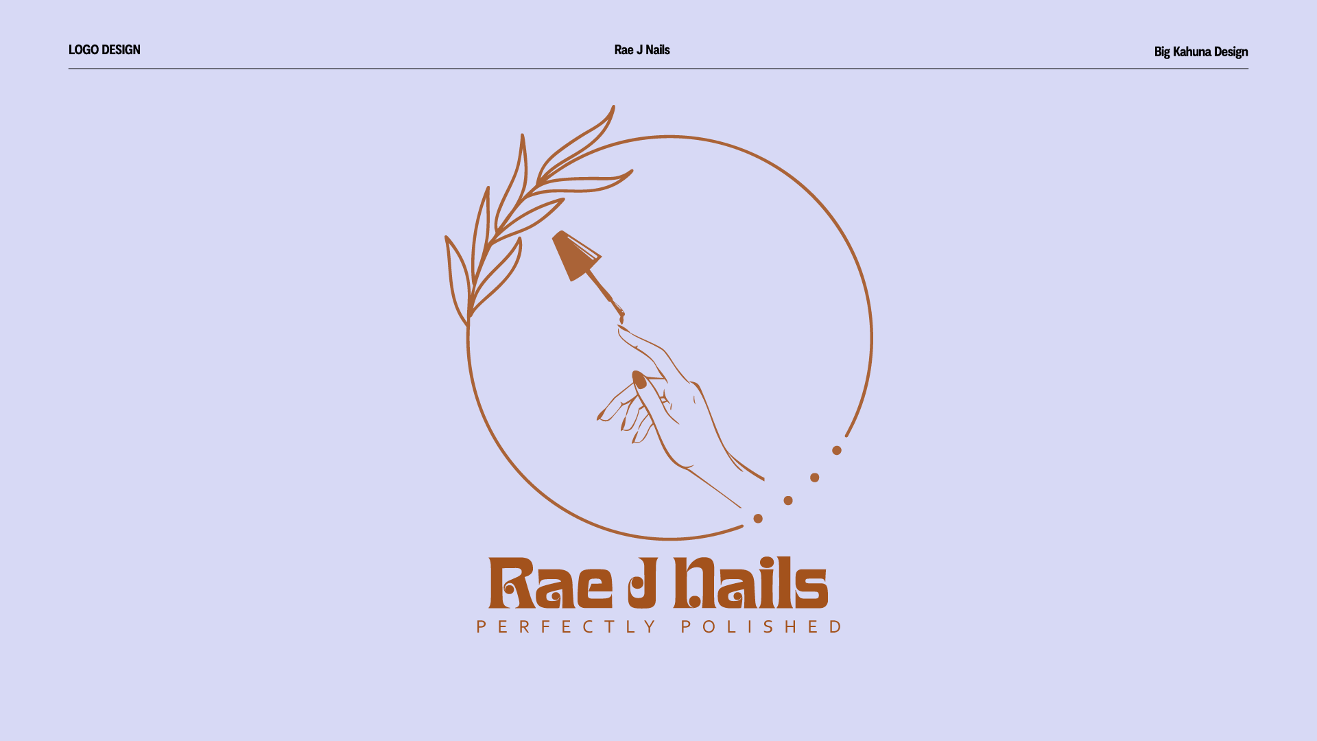
Rae J Nails Logo Design
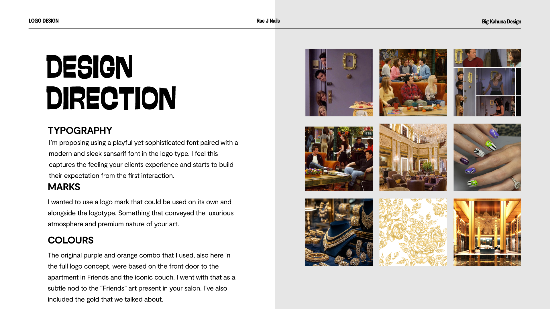
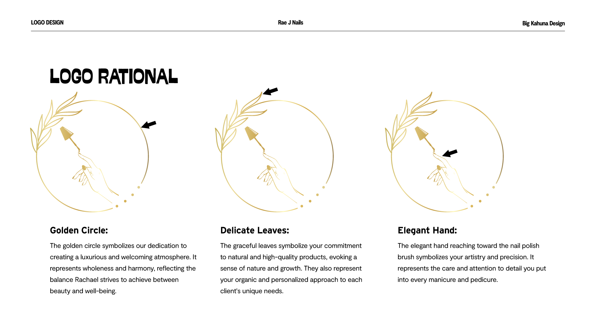
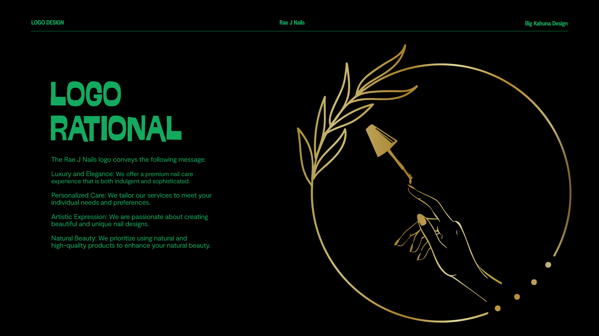
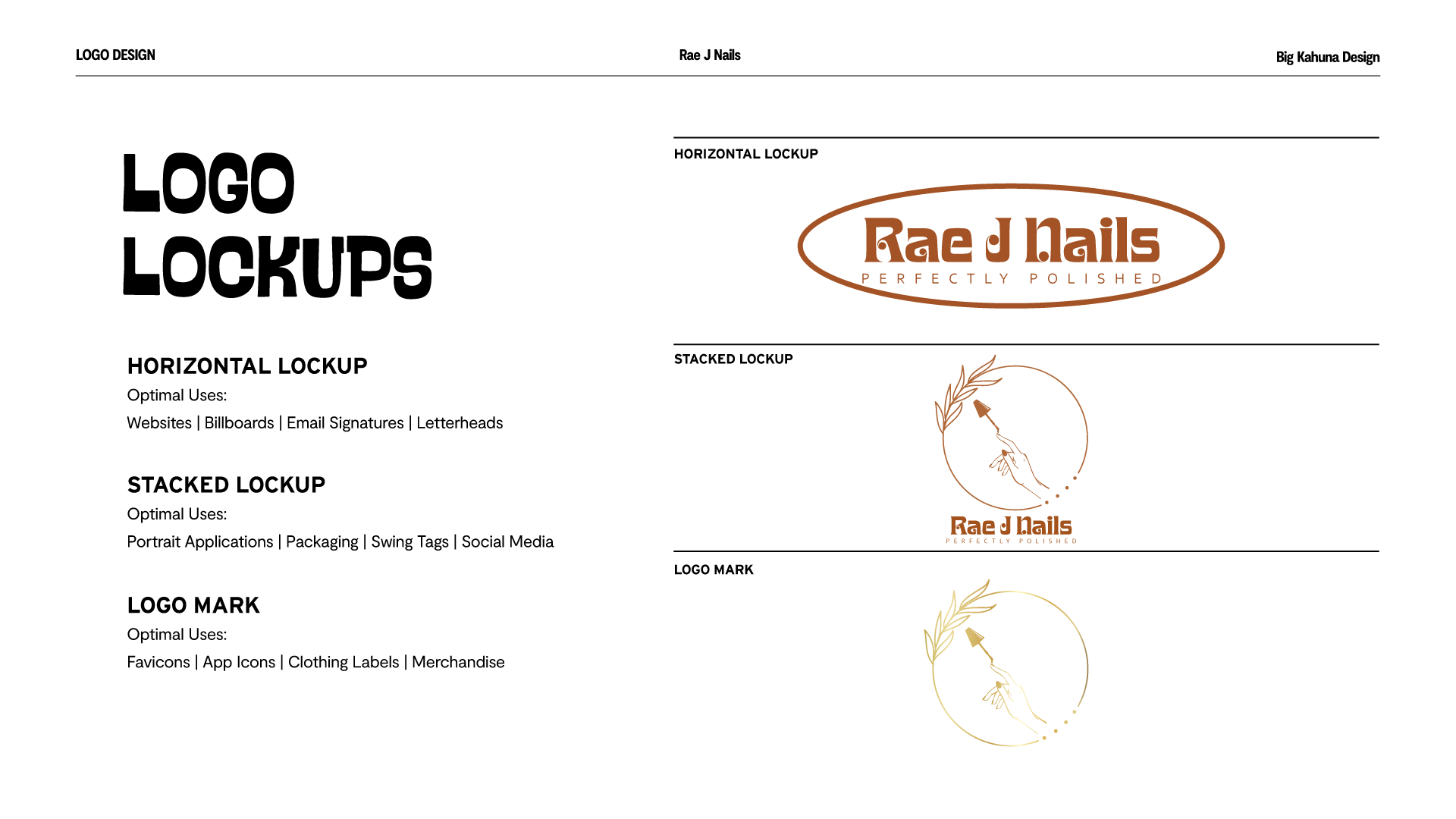
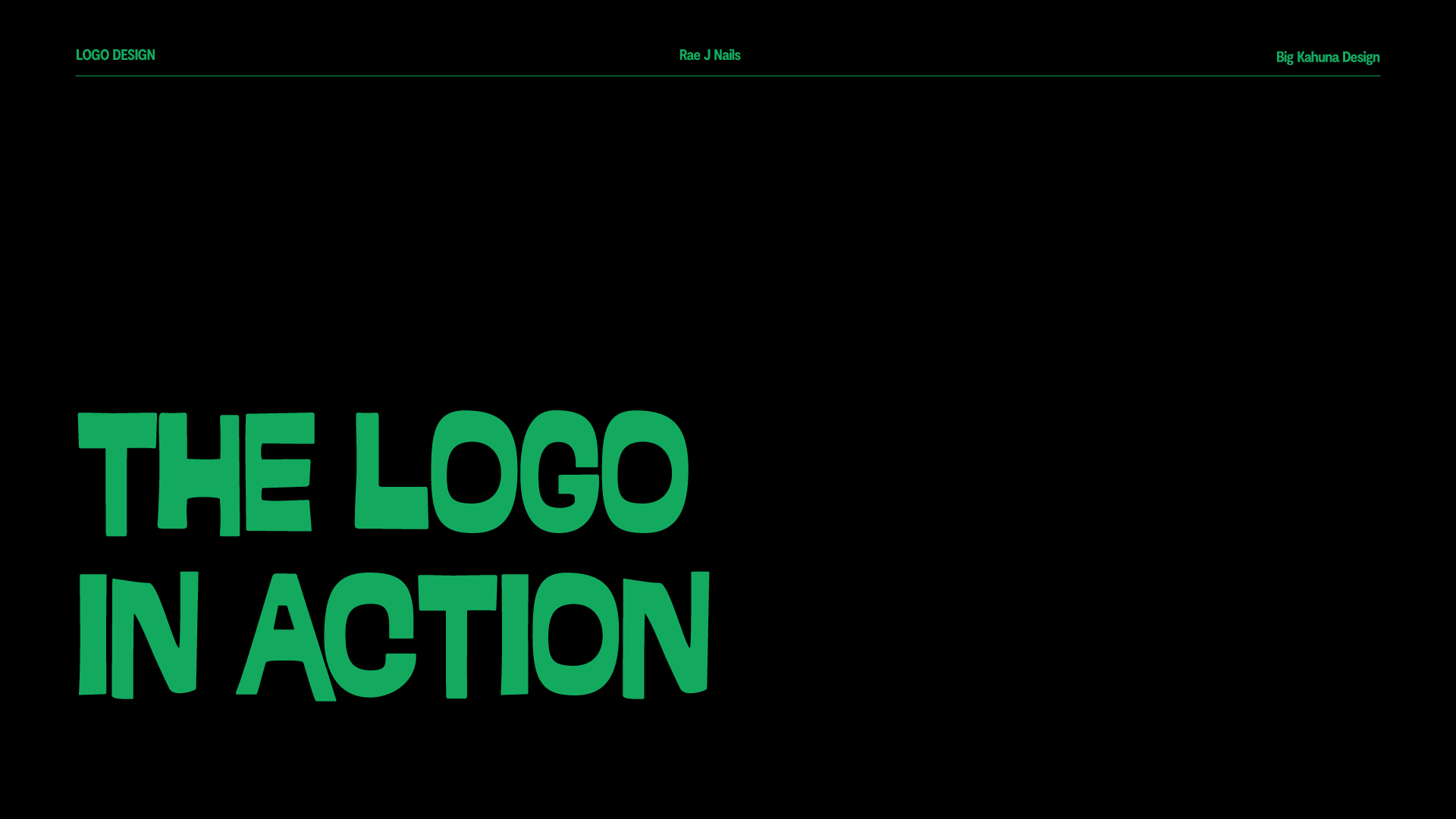
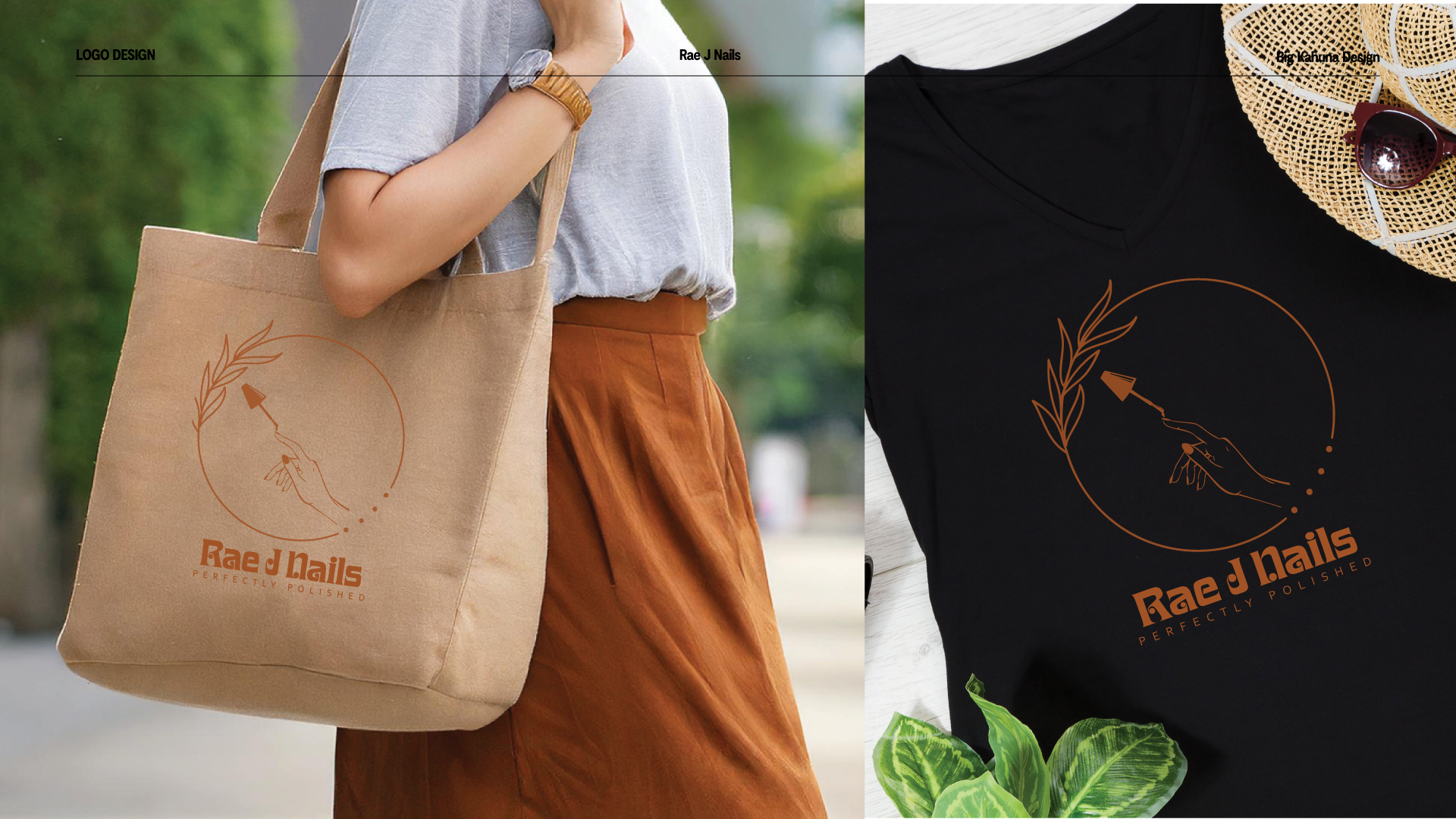
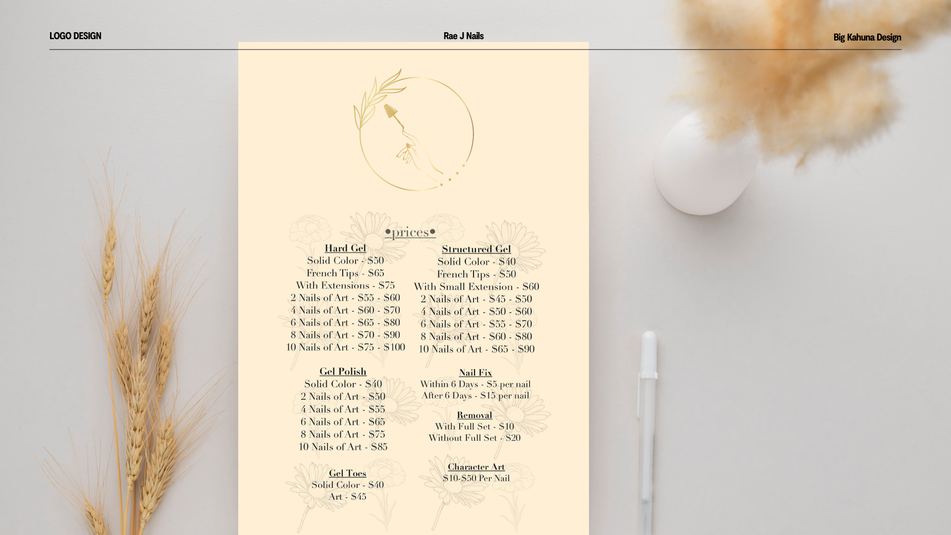
For Rae J Nails, I crafted a visual identity that embodies elegance, artistry, and personalized care. The logo features a golden circle symbolizing luxury and harmony, with delicate leaves representing natural beauty. An elegant hand reaching for a nail polish brush conveys precision and creativity.
The typography blends a playful yet sophisticated font, paired with a sleek sans-serif for balance. Inspired by Rae J Nails’ welcoming ambiance, the color palette integrates rich purples, warm rusts, and gold for a luxurious yet inviting feel.
This project showcases my ability to translate brand values into a compelling visual identity.